Abby George's A2 Media Blog
Monday, 4 April 2016
Tuesday, 29 March 2016
Monday, 28 March 2016
Evaluation Question 1: In what ways does your media product use, develop or challenge forms and conventions of real media products?
Trailers are very important in marketing. It is the closest insight the audience will get with the film. The narrative doesn't give too much away. Our piece was meant to create tension and suspense to interest the audience. Trailers are very short but give the audience enough information about the film. We followed many conventions to make the genre of our trailer clear so the audience would recognise it as a horror. Trailers are published online and on TVs or at the cinema.
Mise-en-scene
Mis en scene is important to horror conventions for many reasons. These conventions of the genre usually consist of low key lighting, darkness that causes uneasiness and frighten the audience when things cannot be seen clearly. We had to use ambient lighting due to our lack of professional technology which would have allowed us a darker tone to the filming images. Colours that are conventional to the horror genre are mainly black and red. Red connotes blood, fear, rage and danger. We have used the colouring of this to present our titles in our trailer. The colour black connotes death and evil, both main themes in horrors. Whereas, we have also used the colour of white to show the purity of the child at the beginning. We have used settings such as the church and graveyards. These are both conventional places with the horror genre. The church is somewhere sacred so when trouble begins there, it causes even more distress for the audience. Graveyards are typical places too as it is the place of the dead.
Characters
The conventional character in a horror trailer usually consist of the main villain and the hero. A lot of the time, a male character is used so we decided to push this idea and use females as both the villain and hero. We also show the death of a male character, showing female dominance. Our protagonist is the Final Girl in the trailer. We also have the children at the beginning that show the ‘innocent child’ character convention.
Iconography
There are iconic elements in all films that the audience will recognise. In horrors they use iconic weapons such as knives and chainsaws. We have stuck with the convention of the excessive use of blood in some scenes and murder. However, we have used our originality to make weapons fitting to our religious theme of our trailer. Therefore, the beads are an iconic element for our trailer.
Camera work
We have used conventional higher and lower angles for our horror trailer that show the superiority of the villain looking down on the hero. We also use a high angle at the beginning with the child which makes her look weaker and smaller. We use mid shots such as the bath tub scene, to make the surroundings feel more enclosed and cause a suffocating effect for the audience that they cannot escape the danger. Point Of View is conventionally used to create suspense in horror trailers as the audience can only see to a certain extent and become uneasy. Handheld cameras are also conventional as they create a shaken effect with portrays the panic within the scene.
Sound
Sound is used conventionally in horror trailers to cause suspense. Stings are the most common to scare the audience. Loud music shocks them when it is unexpected. Narration is used well to tell the story of the trailer. A lot of our dialogue directs about ‘the church’, the main plot of our piece. Sounds are used to create emotion to the trailer. We have used a more peaceful tone of music at the beginning to make it more dramatic when real events begin to happen. This is similar to that of the trailer 'Orphan'. The peaceful tone adds mystery as though the audience know it'll go badly. It makes the characters seem more innocent at the beginning in comparison to how the story will turn out for them, making it more horrific. We use voice overs in our trailer to give more information about the background of the story at the beginning. This is mixed over the top with the peaceful tone of music to create an even creepier atmosphere. We had to be sure that lines of dialogue and music did not drain one another out and become inaudible. This is similar to the 'The Devil's Hand' trailer, in which the voice over gives a clear indication of the plot as it mixes with relevant shots. We added in stings that would cause a 'jump scare' at the end of our trailer. This leaves a lasting impact for the audience and becomes very memorable.
I believe our trailer is edited together to have a professional result. Our use of shots do not sway the audience as put in a chronological order that they can understand. The dialogue steers a lot of the plot and we have used a vast range of imagery to show the theme of our piece, through props and settings. I think we have stuck to the conventions of horror in many ways, as previous mentioned. Our idea is very original due to its religious aspects. I think its originality and use of female dominance will draw in our target audience well.
Generic Conventions of Horror Trailers:
Mise-en-scene
Mis en scene is important to horror conventions for many reasons. These conventions of the genre usually consist of low key lighting, darkness that causes uneasiness and frighten the audience when things cannot be seen clearly. We had to use ambient lighting due to our lack of professional technology which would have allowed us a darker tone to the filming images. Colours that are conventional to the horror genre are mainly black and red. Red connotes blood, fear, rage and danger. We have used the colouring of this to present our titles in our trailer. The colour black connotes death and evil, both main themes in horrors. Whereas, we have also used the colour of white to show the purity of the child at the beginning. We have used settings such as the church and graveyards. These are both conventional places with the horror genre. The church is somewhere sacred so when trouble begins there, it causes even more distress for the audience. Graveyards are typical places too as it is the place of the dead.
Characters
The conventional character in a horror trailer usually consist of the main villain and the hero. A lot of the time, a male character is used so we decided to push this idea and use females as both the villain and hero. We also show the death of a male character, showing female dominance. Our protagonist is the Final Girl in the trailer. We also have the children at the beginning that show the ‘innocent child’ character convention.
Iconography
There are iconic elements in all films that the audience will recognise. In horrors they use iconic weapons such as knives and chainsaws. We have stuck with the convention of the excessive use of blood in some scenes and murder. However, we have used our originality to make weapons fitting to our religious theme of our trailer. Therefore, the beads are an iconic element for our trailer.
Camera work
We have used conventional higher and lower angles for our horror trailer that show the superiority of the villain looking down on the hero. We also use a high angle at the beginning with the child which makes her look weaker and smaller. We use mid shots such as the bath tub scene, to make the surroundings feel more enclosed and cause a suffocating effect for the audience that they cannot escape the danger. Point Of View is conventionally used to create suspense in horror trailers as the audience can only see to a certain extent and become uneasy. Handheld cameras are also conventional as they create a shaken effect with portrays the panic within the scene.
Sound
Sound is used conventionally in horror trailers to cause suspense. Stings are the most common to scare the audience. Loud music shocks them when it is unexpected. Narration is used well to tell the story of the trailer. A lot of our dialogue directs about ‘the church’, the main plot of our piece. Sounds are used to create emotion to the trailer. We have used a more peaceful tone of music at the beginning to make it more dramatic when real events begin to happen. This is similar to that of the trailer 'Orphan'. The peaceful tone adds mystery as though the audience know it'll go badly. It makes the characters seem more innocent at the beginning in comparison to how the story will turn out for them, making it more horrific. We use voice overs in our trailer to give more information about the background of the story at the beginning. This is mixed over the top with the peaceful tone of music to create an even creepier atmosphere. We had to be sure that lines of dialogue and music did not drain one another out and become inaudible. This is similar to the 'The Devil's Hand' trailer, in which the voice over gives a clear indication of the plot as it mixes with relevant shots. We added in stings that would cause a 'jump scare' at the end of our trailer. This leaves a lasting impact for the audience and becomes very memorable.
I believe our trailer is edited together to have a professional result. Our use of shots do not sway the audience as put in a chronological order that they can understand. The dialogue steers a lot of the plot and we have used a vast range of imagery to show the theme of our piece, through props and settings. I think we have stuck to the conventions of horror in many ways, as previous mentioned. Our idea is very original due to its religious aspects. I think its originality and use of female dominance will draw in our target audience well.
Friday, 25 March 2016
Evaluation Question 2: How effective is the combination of your product and ancillary texts?
Above is an annotated video explaning the effectiveness of the combination of my products and ancillary texts. The magazine example used in this video is of my drafted product, however, the information still proves relevant and important.
Film distributors play a vital role when it comes to the
promotion of a film. They are responsible for the majority of the marketing,
and identification of the audience. They decide when and where the film will be
advertised as well as the release date. This is important as to interest the
target audience of the film.
There are many different platforms that can be used when
advertising. These consist of: outdoor adverts (posters, bus signs, billboards,
leaflets), TV and cinema adverts, radio adverts, trailers, social media and
personalised websites etc. This allows the audience to become aware of the
production otherwise they wouldn’t be able to acknowledge its existence. By
covering a large range of platforms, film distributors can reach a bigger
audience. It is important for the film distributors to understand their target
audience as the marketing will differ depending on the demographics and size.
Here are examples of film posters which are aimed at a
target audience of children. These posters use many different bright colours
that stand out for them. They use animated characters that are more creative
and appealing. You can also tell that the release dates have been during spring
and summer holidays, when children are available to go watch.
Here are some examples of posters that have an older target
audience. There horror posters use a lot darker and fewer colours in contrast
to those aimed at young children. There is also a lot more writing mixed with disorientated
imagery which fits with the theme. Instead of using cuter, animated images,
these posters advertise popular actors that will interest its audience.
Wednesday, 23 March 2016
Tuesday, 23 February 2016
Thursday, 11 February 2016
Monday, 14 December 2015
Thursday, 10 December 2015
Trailer Analysis
American Horror Story: Coven (2013)
My first chosen trailer is ‘American Horror Story: Coven (2013)’, this is not a full length trailer as it’s a teaser trailer but still conveys a lot of horror conventions and attributes. The teaser is 30 seconds long which gives very limited time to portray the show as watchable and has no voice over, only music, by the choice of having no voice over this means the characters aren’t introduced by name or purpose and can only be seen. The teaser could’ve probably been improved if a voiced over was used, but the soundtrack (House of the Rising Sun – Lauren O’Connell) worked well with the setting to create an intriguing establishment of the show, the use of indie music makes the entrance of the characters melodic but the conventional imagery suggests otherwise with demonic symbols and imagery suggesting witchcraft and voodoo. Another element that was well portrayed to be considered is the establishing shots of a large house, gated, protected, with a large cult-like crowd walking in with people watching them from windows. The main thing that could’ve dramatically changed the trailer would’ve been the introduction of characters, though you do see the main characters entering the house, looking out of the house and standing high above the others, you learn next to nothing about them other than to interpret who they are by which they are seen doing. Although the teaser was shorter than most they displayed horror conventions quite quickly, the demonic symbolism insinuated a ‘Coven’ of witchcraft; the symbolism is shown on the ceiling of the house and the use of a man-bull opening its eyes. Another convention used was witchery itself as it shows woman floating outside the house, cats and black clothing. The trailer used music to establish the mood of the show by using the genre of indie music and the lyrics in the song chosen fit the plot very well about being ‘one of them’, the song chosen is quite slow but gives the trailer a modern sense. The trailer also stuck to the conventions of a trailer as it established the main placement of the TV series.
Carrie (2013)
My second trailer is ‘Carrie (2013)’, the trailer used the build up effect which makes the trailer more intense as it progresses, which captures the audiences attention very quickly but had a very slow start which made it less appealing to the viewer. I liked the use of inter-titles with the voice over together as they establish the plot and story quickly, the fading used on the inter-titles however make it less dramatic and softer than it should be for a horror movie trailer. I disliked the choice in music as it was very slow and when the scenes picked up in pace the music rarely did, it was harsher but did not fully make it as impactful as it could’ve been. I feel that the music would’ve made a dramatic change to the trailer if it has become faster as it would’ve been easier to watch and would’ve portrayed the movie as more of a horror than a romance. The trailer portrayed horror quite easily by showing Carrie covered in blood and her violent outbursts from the famous prom scene, to counter this it was showing her in a much more lit scene making her prom dress with relaxing music on in the background. It was evident that the trailer was for a horror because of the tension building short shots at the end, a common shot list used to introduce horror movies intentions and characters fates. In this trailer it uses most of its time to introduce the characters in depth, a typical convention for a full time trailer. By using most of the time to do this it helps to further the plot and understanding of the mind-set Carrie has.
The Woman in Black (2012)
My third trailer is ‘The Woman in Black (2012)’, this trailer used creepy and high pitched music to create an atmosphere to fit the film, and the music included music box chimes and a spike towards the end when the pace built up. The trailer also had a child voicing over while showing establishing shots and old fashioned toys. As a result of the voice over and creepy music it was effectively able to catch your attention and make it memorable. At the beginning of the trailer there is complete silence which is very uncomfortable for the viewer and because of the lack of character introduction Daniel Radcliffe’s character seemed out of place and wasn’t really explained, this made it very vague and this may make it confusing for the audience. I feel the lack of information about the main character may have been a big mistake and could’ve made the trailer better in the long run. The trailer portrayed the horror genre very well through conventions such as jump scares towards the end, a subtle hint at the supernatural and even including children. The main conventions for the trailer would be the huge amount of establishing shots to set the scene for the movie, the spike in the music and the fast paced shots towards the end, by using these they have successfully established the trailer and the horror movie setting.
Tuesday, 10 November 2015
Film Distribution and Marketing
What is meant by the term film distribution?
Film distribution is the process of making a film viewable
to an audience. It makes it accessible and attractive towards them. Film
distributors share and discuss their idea with the film makers and producers.
Once assigning the rights to a producer or company, they take rights to the
marketing and campaign to raise the film’s awareness to the public.
Advertising, marketing and cinematic release is all a result of film distribution.
What does a film distributor do?
The distribution company works hard to ensure that the
budget for the film is not wasted and a high profit can be made where possible.
They look into the target audience and decide what marketing materials would be
best suited to attract them specifically. In order to make the film do as well
as possible, they take charge in advertising and spend money wisely in order to
achieve this. They decide the scale of release of the film and where and when
it will exactly be distributed.
How does reach relate to film distribution?
The term ‘reach’ is used for the audience scale that the
film will be available to. The reach varies greatly on the variety of film that
is to be distributed.
What is meant by the distribution plan?
The distribution plan is the plan created by the film
distributers in terms of where the film will be shown, setting out how and when
they will be distributed. The plan sets out important information such as the
exact release date.
What is meant by the marketing plan?
The marketing plan focuses much more on the audience as
consumers. It plans how the advertising will take place to attract a specific
target audience. The marketing plan will use methods such as marketing research
to understand how to really connect and appeal to their target audience more.
The marketing plan is important as it is the first way the audience will become
award of the film and plays a very important role in raising interest for it.
What is the difference between advertising, publicity and
promotion?
‘Advertising’ refers mainly to trailers and posters which
grab the audience’s attention and makes them aware. ‘Publicity’ takes place in
the hands of the actual cast more than anything. This means they will go out to
do interviews, red carpets, and events on more mainstream media where they can
talk largely about the film and go into more depth to make it appeal to
onlookers. ‘Promotion’ is where the distribution company works with other companies
to raise even more awareness. These are known as ‘promotional partnerships’.
Allowing the audience to become more interactive with the film.
The Woman In Black-Main Trailer
The Woman In Black was distributed by Momentum Pictures (UK), Alliance Films (Canada) and CBS Films (US). It was released in 64 countries, from Canada on February 3rd 2012 to Japan on December 1st 2012.
The Woman in Black questions
Who do you think the primary and secondary target audience is for The Woman in Black? Why?
Primary- Teens/Young adults. Being certificated a ‘12’ was to draw in the audience and make it suitable for Daniel Radcliffe’s fa
ns who know him from Harry Potter which primary audience is younger people. Around this age, Horror is most popular but the popularity of the film rides mainly on the star’s power.
Secondary- The secondary audience would be people of an older age range. The film is based off the novel released in 1983 so the older audience will be fans of this gothic literature and understand the mature themes of the film better than the primary audiences.
How was The Woman in Black marketed? (Think about genre(s), subgenre(s), media platforms, target audience, promotions, size of campaign, etc).
The Woman in Black was marketed as a clear horror and supernatural thriller through the use of ghosts and a haunted house imagery on posters matching with the subgenre’s clear conventions. It is Daniel Radcliffe’s first major role after the Harry Potter franchise. His name and picture are very clearly displayed on posters, trailers and promotional videos. He participated to increase the popularity and promote the film to his best extent to change his image and be shown as a serious actor. The use of internet attracts a more young audience in comparison to print advertisement for an older.
Do you think the marketing materials for the film were appropriate? Why?
I think the marketing materials were appropriate for the film a lot of them were based through social media and online which would target the younger teen audiences who are the primary target audience. A lot of competition were also held which would attract a much younger audience such as fans of Harry Potter who know Daniel Radcliffe well in that role.
What kind of release did the film have? (Big/small? How many cinemas showed the film on its release?)
The film had a rather large release grossing a total of $128,955,898 worldwide.
How much did The Woman in Black cost to make? (Production budget) AND what was the industry impact of The Woman in Black? (Think box office and trends).
The Woman in Black came second place in the box-office and earned itself the title of biggest US opening for a Hammer film in all of Hammer history. In all, the budget for the film was only $15million.
Why do you think the film was so successful? (You must come up with at least two reasons).
One reason as to why the film was popular was due to the cast’s impact. Using a popular actor such as Daniel Radcliffe who had just come out of playing the biggest role of his life-Harry Potter, which is known worldwide, caused a massive impact on the audience as a whole. I think another reason was due to the highly productive marketing materials and variety they brought. Through marketing, the film could engage with audiences through use of internet, billboards, posters and articles in magazines and newspapers. This would have attracted a large range of both the primary and secondary target audience and made the film itself incredibly unavoidable.
Tuesday, 3 November 2015
Cabin in the Woods Questions
1. What were Jeremy Tunstall’s 4 character roles for women and do they apply to The Cabin in the Woods?
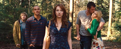
-Domestic
-Sexual
-Consumer
-Marital
Jules applies to the Sexual role of a woman because she is most sexualised. Although everyone is sexually active within the film, she is the one that is seen having intercourse with Curt in the Woods.
Lin applies to the Domestic role because she is the assistant that is seen helping out the other men, however she is still bossed around to an extent.
Dana and Jules are good examples of the Consumer role because they are typical teenage girls. When we first see Jules and Dana, we are told that Jules dyed her hair, a representation of consuming.
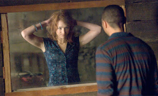 Dana is the most marital out of the female characters in Cabin In The Woods because she is the less sexualised and although not married, she has an attachment and sense of loyalty to one person.
2. How is Dana typical of Clover’s ‘Final Girl’ theory? Please mention: the ending; Dana’s appearance and her actions during the film.
Dana is typical of the ‘Final Girl’ theory because she has an androgynous name and appearance, dressing less revealing in comparison to the others. She is less sexually active and not blonde. She fights for her life until the end, although it is most likely she died, she is the last remaining.
3. Jules undergoes mental and physical transformations during the film, what are they and how do they cause her to become a horror archetype?
Physically, Jules undergoes the transformation of hair colour to become a blonde. Blondes in horrors are typically known for being the first to die, which then goes on to happen. She becomes more sexually active once at the Cabin which puts her at more risk of becoming a victim in a horror as most characters die as a result.
4. Is Mulvey’s Male Gaze theory exemplified in the film and if so, how? Think about framing, camera angles and POV shots.

Mulvey’s Male Gaze Theory is when the camera acts as the eyes of a heterosexual male to view females as sexual objects. Curt eyes his girlfriend at one point, where the camera follows him as a POV shot. When we first see Dana, she is in her underwear and the camera makes sure to point this out by focusing on her lower body.
5. In the film we, as an audience, are made to be voyeurs; when does this happen and why is it important in regards to representation of character?
A voyeur is a person who gains sexual pleasure from observing others naked or also carrying out sexual activities, also a person who gains pleasure from watching their pain. We become voyeurs during the scene where Jules does stuff with a wolf, leaving her boyfriend to watch on. This shows the more sexually active characters in comparison to the others and the extents they will go to as well as the outcome of their actions.
6. (Briefly) Summarise the way women are represented in The Cabin in the Woods. Are they objectified and there to provide satisfaction for heterosexual males and/or do they fulfil another role/purpose?
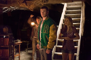 Women in The Cabin in the Woods are represented incredibly sexualised, attracting the heterosexual male. They do provide satisfaction and are objectified but are used a lot to create humour as well.

-Domestic
-Sexual
-Consumer
-Marital
Jules applies to the Sexual role of a woman because she is most sexualised. Although everyone is sexually active within the film, she is the one that is seen having intercourse with Curt in the Woods.
Lin applies to the Domestic role because she is the assistant that is seen helping out the other men, however she is still bossed around to an extent.
Dana and Jules are good examples of the Consumer role because they are typical teenage girls. When we first see Jules and Dana, we are told that Jules dyed her hair, a representation of consuming.
 Dana is the most marital out of the female characters in Cabin In The Woods because she is the less sexualised and although not married, she has an attachment and sense of loyalty to one person.
2. How is Dana typical of Clover’s ‘Final Girl’ theory? Please mention: the ending; Dana’s appearance and her actions during the film.
Dana is typical of the ‘Final Girl’ theory because she has an androgynous name and appearance, dressing less revealing in comparison to the others. She is less sexually active and not blonde. She fights for her life until the end, although it is most likely she died, she is the last remaining.
3. Jules undergoes mental and physical transformations during the film, what are they and how do they cause her to become a horror archetype?
Physically, Jules undergoes the transformation of hair colour to become a blonde. Blondes in horrors are typically known for being the first to die, which then goes on to happen. She becomes more sexually active once at the Cabin which puts her at more risk of becoming a victim in a horror as most characters die as a result.
4. Is Mulvey’s Male Gaze theory exemplified in the film and if so, how? Think about framing, camera angles and POV shots.

Mulvey’s Male Gaze Theory is when the camera acts as the eyes of a heterosexual male to view females as sexual objects. Curt eyes his girlfriend at one point, where the camera follows him as a POV shot. When we first see Dana, she is in her underwear and the camera makes sure to point this out by focusing on her lower body.
5. In the film we, as an audience, are made to be voyeurs; when does this happen and why is it important in regards to representation of character?
A voyeur is a person who gains sexual pleasure from observing others naked or also carrying out sexual activities, also a person who gains pleasure from watching their pain. We become voyeurs during the scene where Jules does stuff with a wolf, leaving her boyfriend to watch on. This shows the more sexually active characters in comparison to the others and the extents they will go to as well as the outcome of their actions.
6. (Briefly) Summarise the way women are represented in The Cabin in the Woods. Are they objectified and there to provide satisfaction for heterosexual males and/or do they fulfil another role/purpose?
 Women in The Cabin in the Woods are represented incredibly sexualised, attracting the heterosexual male. They do provide satisfaction and are objectified but are used a lot to create humour as well.
Thursday, 15 October 2015
Saturday, 10 October 2015
The Crazies Questions

1.Does The Crazies follow the Classic Narrative Structure? Why
or why not?
The Crazies does not follow the Classic Narrative Structure
as it starts off with a disequilibrium wherein Rory is shot after going on the
baseball pitch supposedly drunk. Even at
the end, there is no resolution.
2.How many of Propp’s character types can be identified in the
film?
Propp’s character types can be identified through:
Government: VillainsDavid: Hero
 Judy: Hero, Dispatcher
Russell: Helper, Donor, False Hero
Becca: Princess
3.List five examples of binary oppositions in the film and
explain them briefly-
Good/evilGood and evil contrasts are shown in The Crazies through the Government characters playing the evil and the heroes of David and Judy being good. The Government are the ones that caused the outbreak whereas David and Judy are just over victims and trying to help others, balancing each other out.
Science/nature
Science is shown as the outbreak occurred due to this
weapons production. Nature is shown through the spread of it.
Past/present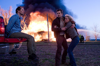 Past and present is shown through the duration of the film
as it becomes apparent that the weapon was in the making years ago but only
having an affect now.
Past and present is shown through the duration of the film
as it becomes apparent that the weapon was in the making years ago but only
having an affect now.Normal/Abnormal
4.Identify the three ‘durations’ and give an estimate of the
time each duration covers.
The film lasts 92 minutes. The plot, what is actually shown
in the film, is around 2-3 days. The story itself spans over 2-3 years,
consisting of the weapon making mainly.
5.Give two examples of events that cause later events in the
film but which occur before the film ‘starts’.
-The plane crash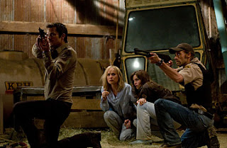
-How Rory got infected
6.List two events from the 92 minute film that happen in a
different time and space to the one we are shown.
-Plane crash
-Making the weapon
Narrative Theory in relation to Halloween and The Crazies

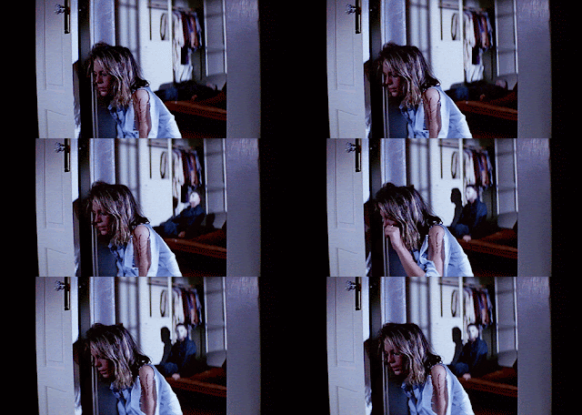 The term Classic Hollywood Narrative refers to the idea that
most films follows the basic narrative structure of a beginning, middle and
end. Todorov suggested that all stories begin with an equilibrium which is then
disturbed by a disequilibrium. A series of events the happen which are then
restored into a new equilibrium. The Classic Hollywood Narrative is useful to
help understand media text as it helps us understand why events within have
happened. It helps us understand the characters and how they deal with
incidents that occur within the story and why these incidents have happened.
Halloween does not follow the Classic Hollywood Narrative. At the beginning of
the film we are shown a previous event that brought the killings on, where Mike
Myers kills his sister. After this we are taken to the present day where he has
got out of the mental institute he was kept it and now he is on another
rampage. The killer’s main character in this film is Laurie from the start, but
without any initial reason. In the end, she survives whereas her friends so not
because they were not focused on their surroundings. Laurie is the ‘final girl’
that strives to make a stand against her attacker and then wins. Although she
manages a variety of times, she still does not manage to kill him and the film
ends of a cliff-hanger as he gets away once again. I think this ending has been
carried out to cause suspense and scare the audience even more as well as it
leaves the film open for sequels. The Crazies does not follow the Classic
Narrative Structure as it starts off with a disequilibrium wherein Rory is shot
after going on the baseball pitch supposedly drunk. Even at the end, there is no resolution.
Propp was a Russian critic who examined 100s of examples of
folk tales to see if they shared any structures. In conclusion, he identified 8
different character roles. Propp’s various character types consisted of: The villains,
the hero, the donor, the helper, the princess, her father, the dispatcher and
the false hero. These character types help us identify and relate to characters
in media text but not really the text itself. Not enough about the actually
plot can be given through just knowing these character types. In Halloween it
is obvious that the villain character is Michael Myers. Laurie is the hero in
the aspect that she is the main protagonist. In ‘The Crazies’ Propp’s character
types can be identified through: the Government as Villains, David and Judy as Heroes,
Russell as the Helper, Donor as well as False Hero and Becca as the Princess.
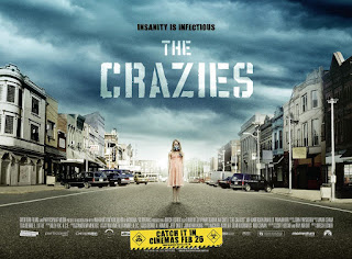 Binary oppositions are sets of opposite values which reveal
the structure of media texts. It was Claude Levi-Strauss who looked at this
narrative structure. Binary oppositions are useful for understanding media
texts as they outline the genre and give the audience a sense of what to expect.
Although they do not show the order in which events are arranged in the plot
but they do give a deeper understanding of themes within it. Within the film ‘Halloween’,
5 binary oppositions we see include: Good vs Evil, Normal vs Strange, Alert vs
Distracted, Innocent vs Guilty and Past vs Present. In ‘The Crazies’, 5 binary oppositions
are Good vs Evil, Science vs Nature, Past vs Present, Known vs Unknown, Normal
vs Abnormal.
Bordwell and Thompson defined narrative as “a chain of
events in a cause-effect relationship, occurring in time and space”, meaning
that the events within the film effect the rest of the time and space of it. For
them, a narrative typically begins with one situation, a series of changes
occur according to a pattern of cause and effect; finally a new situation
arises that brings the end of the narrative. I think this is a very important
narrative structure in terms of looking at media texts as it shows clearly the
consequences of action within. It shows exactly how and why certain parts have
turned out the way they have, linking actions together. 2 events that happen in
the film ‘Halloween’ that cause other events to happen are when Michael kills
his sister and then goes on to mass kill in a similar way for the same reasons
and when Laurie first goes near the abandoned house and Myers follows her from
then on. In ‘The Crazies’ 2 such events would be the crashing of the plane
which contaminated the water and how the first victim, Rory, became infected. 2
events that we know happened in the film but do not see are when they explain
that Myers was kept in some kind of asylum where he was studied by psychiatrists
and his release. The plane crash and weapon making in ‘The Crazies’ are 2
events that happened but are not shown on screen.
Monday, 5 October 2015
Tuesday, 29 September 2015
Magazine and Poster analysis
This poster from Scream 4 is a conventional Horror movie
poster. The use of the mask as the main image turning into a knife at the
bottom gives a clear insight to the main character of this specific film. The
mask is the disguise and the knife is the obvious weapon. There is a slight
glowing effect around the image which adds to the spooky and sinister effects
caused by Horror films. The knife effect is used again in the title underneath
where it blends into the end of the ‘M’.
There are only three different colours used on this poster
but its simplicity makes it more effective. The background being black reflects
the dark atmosphere expected from Horror films. This blackness makes the image
stand out more so it attracts the audience’s attention, being centred on the
image as well also means it’s the first thing the audience will see. The title
at the bottom reflects the image and is the same colour as it and the text
above. The number ‘4’ is in red which is repeated in the release date below.
This is the only use of red on the poster. This makes the 4 memorable for the
audience as it stands out. The audience can recognise immediately that this is
the fourth take on the film so it will encourage them to go and watch the ones
from before.
There is no more text other than ‘New Decade. New Rules’.
This leaves a vast amount of empty space on the poster so the only thing the
audience are left to look at is the mask blade. This makes the poster appear creepier
to the audience.
In this cover for Entertainment Weekly magazine the colours
are very conventional for a Horror magazine with uses of red, white and black. These
colours are very typical within this genre to portray the dark atmosphere and
reflect danger such as blood and death through red and black.
The masthead is situated near the top of the magazine so it
attracts the attention of the audience straight away and they can immediately
recognise the magazine they are reading. The font is often used and iconic to
this certain magazine. The title is in white with the word ‘weekly’ inside the
last four letters in black. This makes the entire title stand out and easy to
read.
The image used on this magazine cover is from the movie
‘Scream’, an iconic Horror film. This mask is the thing the audience will recognise
most in relation to the film.
The sub titles for this magazine all present other famous
names that the audience may recognise. There are also references to music and
technology to suggest that it is aimed at a younger audience. Situating the
main title at the bottom right corner means more of the picture is displayed,
but the audience will see the text as they look at it. The sub titles carry on
underneath the main title. The first is relevant to this main title and uses
alliteration in the form of ‘the bloody battle’ and puts ‘Scream 4’ in bold to
attract attention to it. All the titles are in the same white colour to create
a sense of union with the masthead of the magazine.
The picture is of the supposed cabin that is in the woods,
as the movie title would imply. It has been edited so it causes the illusion
that the cabin is spinning and in three separate parts. Straight away, the
audience can tell that this cabin isn’t anything near the normal, sparking more
interest.
This poster has used a very simple yet effective
font. The letters are very thin to make it creepier. The text is all in the
same font and colouring. The date for the film is bigger at the bottom near the
credits. There is no text at the top of the poster but, between the main
picture and title, there reads the text ‘you think you know the story’. Putting
this in second person makes it more direct at the audience, involving them into
the plot and motivating them to go see the film for themselves to understand
what this means.
On this cover for Empire Magazine they have used the image
of an iconic villain-The Joker. In this picture, he is making direct eye
contact which will intimidate the reader and suggests what his character is
like. Behind him is the logo of Batman, the hero in this story. It is an image
anyone can immediately recognise. This will interest the audience, who are film
fans. Being situated above The Joker’s head and at the top, in the middle of
this magazine cover, it attracts the most attention to itself. It is also the
only part of the magazine to be in a light background.
This cover has used a range of colours, mainly purple and
green to connect with the image of The Joker who connotes these colours most.
The cover has used spray paint effects to background the white text they have
used on sub headings. As well as this, the text stands out against the dark
background of the image. The masthead is the same as the majority of Empire
magazines so it can be recognised in an instant. It is the only text in red
which makes it more attractive. A link to the website is below the masthead in
the same colour so it can be noticed. This also implies that the target
audience of this magazine would be of a younger age, who have access and know
how to use social media.
The sub headers all relate to other popular and famous films
as well as big names that the audience may recognise or even be a fan of. This
magazine have used a more playful font across the main image in the middle.
This playful font reflects the personality and nature of The Joker’s character
and gives the reader this insight through the use of mixing it with a quote
which describes him.
Under the bed (2012)
This movie poster is very conventional to the genre of
Horror.
The movie title stands out the most as it is clear and
brighter in the colour of red. Red is typically used in Horror posters to
convey danger and blood. The rest of the poster is very dark with only use of a
few colours such as black, white and grey.
The effect of the arms reaching out under the bed and
causing scratch marks is relevant to create fear to the target audience,
therefore conventional to the Horror genre. The rest of the image under the bed
is unclear, giving the sense of mystery to the audience and causing distress as
to what it could be.
The font is very bold and being the colour red, and the only
text of that colour, the title is the first thing that attracts the audience’s
attention against the darkness of the picture. There is a very little range of
colours. The quotes at the bottom of the poster are of the same font, giving
the poster more sense of collectiveness. The quotes are easy to read and give a
good impression of the film which will interest the audience. There are three quotes at the bottom and one
larger at the top, by a more important person. The fact that someone higher-up
is saying positive quotes about this film will intrigue the audience into
thinking it’s worth a watch.
This cover for ‘Scream’ magazine is very conventional for a
Horror magazine. The excessive use of red is typical for the Horror genre as it
reflects blood and danger. The colour is usually used and easily recognisable
to the target audience who would relate it to this genre. There is also blood splatter
effects used in relation to this. The main image on the front is quite dark,
with a grey, silver-like, colour which also reflects the dark and gloomy theme
of Horror. The use of white and yellow on the titles helps it to stand out
against the dark background. On the title there is also the effect of dripping
which reflects the blood effects present on the magazine and sticks to the
conventions of the Horror genre.
There is a web address at the top right hand of the
magazine, implying that the target audience will be of a younger age. The
images used of this magazine cover are all conventional images you would expect
from a Horror movie. As well as using popular actors to grasp the audience’s
attention, this magazine shows the typical characters looking sinister,
zombies, torture and Frankenstein. These images make the genre obvious. As well
as showing updated images from new films, this magazine also explores some of
the history of Horror by putting the image of Frankenstein in sepeia colouring
to show it’s age as well as putting the text ‘Hammer’s Classic Revisited!’ .
‘Revisited’ implies that the film has been out for a long time and they want
the audience to look back at it.
Saturday, 26 September 2015
Wednesday, 16 September 2015
Halloween Questions
How does the start exemplify a common technical code
convention of the horror genre?
 At the beginning of the film, it shows an event from years
ago in which a younger Michael kills his sister. This shows the beginning of
the many murders that will take place. As well as this, this opening sequence
is all from the P.O.V shot of Michael’s. Michael places a clown mask on his
face so the audience have to watch through his limit vision, which adds to the
scariness of the film as there is a restriction of what can be seen whereas, as
the film progresses, the audience can see everything and are aware of the
action taking place.
How does the setting fit with the horror genre?
 The setting fits with the Horror genre because it all takes
place over one night on Halloween in an enclosed and empty, suburban area.
There is an abandoned house on the streets that no one dares to enter. There
are also many references to a mental institution at the beginning, which
withheld Mike Myers.
What iconography of ‘innocence’ do we hear or see early on?
 Early on we see the innocence of Michael as a child at the
beginning where he kills his sister. He is dresses up and wearing a clown mask,
a very childlike act and sticking to the conventions of Halloween. Laurie is
seen as innocent as she is virginal and smart, she is less concentrated on sex,
and instead she notices the murder in comparison to her friends who are easily
distracted.
What was the main industry impact of Halloween?
The film ‘Halloween’ was very cheap to make. With this came
higher profits, which meant more copies of the film were made. It unintentionally
marked the beginning of the ‘slasher’ genre as well as created big names.
Name some ‘slasher’ films which followed on from Halloween:
Friday The 13th, Prom Night, Bloody Valentine,
Terror Train, Night School, The Burning, Graduation Day, Happy Birthday To Me,
Hell Night, The Slayer, The Prowler.
What are the four plot rules of the ‘slasher’ film sub-genre
which Halloween began?
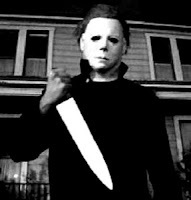
- Traumatic event involving killer
- Killer returns
- Kills obnoxious teenagers
- ‘Final girl’ survives, killer may or may not die
Give three ways in which Laurie is androgynous:
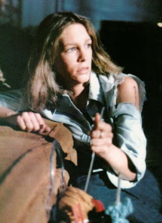 One way that Laurie is androgynous is due to her manly features
such as her deep voice and fashion sense which makes her stand out against her
very feminine friends. In comparison to her friends, she dresses in trousers
and less fashionable clothes whereas they wear more revealing, short skirts,
with longer and styled hair. Laurie is also very brave and focused unlike her
friends. She is also incredibly intelligent. In the film she states how men are
‘afraid’ of her because she’s ‘too smart’.
What does the extract mean by ‘a reactionary sexual agenda’?
The killer kills after witnessing their sexual activities.
How does the director, John Carpenter, counter the
suggestion that Halloween had a reactionary sexual agenda?
John Carpenter says that the victims of Mike Myers were
killed because they were not watching, they were distracted. The virgins
traditionally survive whereas those that engage in sexual activities are
punished afterwards. Around the 1970’s, when ‘Halloween’ was released, a lot of
the population would sleep around in their younger years so this was done as a
king of warning. The director states that Laurie was the intended victim all
along.
Why does Mike Myers kill his sister?
At the beginning of the film, Mike Myers uses his knife as a
phallic symbol as we see him kill his sister after witnessing her in a sexual
act. He kills her for the sole reason that he is purely evil. Other characters
throughout the film explain how he always acted ‘inhuman’ and possesses
supernatural traits. The stabbing action can also be presumed that he done so
because he was mimicking the male’s action’s with his sister. As his innocent
eyes saw, a man was stabbing her so he did the same in return.
Subscribe to:
Comments (Atom)


